
Project Number: IQP 50-JRBOZ06
SMOKE ALARM BROCHURE DESIGN
USING VISUAL COMMUNICATION
An Interactive Qualifying Project Report
submitted to the Faculty
of the
WORCESTER POLYTECHNIC INSTITUTE
in partial fulfillment of the requirements for the
Degree of Bachelor of Science
by
___________________ ___________________
__________________
Michael Ciman
Kenneth Gagne
Michael Jacene
Date: May 03, 2000
Approved:

1. smoke alarms
2. pamphlet design
3. visual communication
_______________________________
Executive Summary
Smoke alarms can help to save lives. According to the Melbourne Fire & Emergency Services Board (MFESB) over the last three years fifty-two lives have been lost, eighty-five million dollars worth of property damage has been reported, and the MFESB has attended twenty four thousand fires (MFESB web site). Fires can break out anywhere and any time if the conditions are correct, but much of the injury and damage from fires can be prevented if people have the early warning that smoke alarms can give.
Existing smoke alarms are aimed at a public which consists of literate, especially English-literate, people. People with poor English language skills, such as illiterate persons or English as Second Language (ESL) speakers, may find essential information about smoke alarms inaccessible to them.
Scientific Services Laboratory, a government laboratory in Melbourne, Australia, requested the design of a smoke alarm informational brochure aimed at these audiences. Through use of pictures, pictograms, and efficient layout methods, such information can be made accessible to all people, regardless of language background.
A pilot study was conducted in Worcester, MA, with a classroom of adult students, mostly ESL. Observation of their attempts to install a smoke alarm using the included manual produced a set of concepts that needed to be tested. These concepts included methods of visual communication, such as the amount of color or context necessary to make a function as understandable as possible.
Once in Australia, a survey was created that tested these concepts. Several sets of pictures each tested different aspects of the same concept. For example, to determine how much color to use in designing a picture, three pictures were presented: one in black and white, one in color, and one using color highlights. Students were asked to choose the picture they felt best communicated the necessary information. These students comprised summer classes at the Council of Adult Education (CAE) and Adult Multicultural Education Services (AMES).
From the results of these tests, a set of guidelines could be drawn. These guidelines can be used when designing documents that will be accessible not only to people of average literacy, but also persons who are literacy-challenged. The guidelines include suggestions for the use of both pictures and text in a document, as well as the visual layout. For example, pictures should often use color highlights to draw attention to important parts of the object or activity being depicted. Text should be placed to the right of the picture; since most languages read left-to-right, this will draw attention to the picture, and allow the text to be supplementary. The document itself should be a six-page, folded item, allowing for plenty of room to place the text and pictures without crunching information together in a confusing manner.
The guidelines were then applied to the design of a prototype pamphlet that could communicate information to those with lower communication skills. Six pages in length, including the cover, the document covers essential information pertaining to smoke alarms, including their function, where to purchase them, proper installation locations, and maintenance.
Abstract
Scientific Services Laboratory commissioned a project for the design of a smoke alarm informational brochure. The intended audience was the illiterate and people whose first language is not English, who may not feel existing alarms are accessible to them due to the complex, written instructions. Surveys and discussions with people with poor language skills was key in generating ideas for manual design, then testing the manual with those people to develop improvements for the design and implementation of the product.
Acknowledgments
This project could not have been possible without the help of several people:
Michal Avram of Clark University in Worcester, Massachusetts, and an Adjunct Assistant Professor at WPI. Besides helping us get started with the project, she put us in touch with Mrs. Ivana Gordy at St. Paul's Outreach, and also helped us develop our methodology once in Melbourne.
Mrs. Ivana Gordy of St. Paul's Outreach, a division of Quinsigamond Community College. She allowed us into her classroom to conduct our pilot study with her students, giving us valuable feedback and experience.
Barbara Gleason of the Council of Adult Education and Jackie Springall of the Adult Multicultural Education Services, both of Melbourne, Australia. Our final guidelines were achieved through the results of surveying their classes. We appreciate their time and patience in talking with us to set appointments, and their willingness to let us into their classroom.
Mark Swiney of the Metropolitan Fire Brigade, for helping us narrow our focus of Australian building types applicable to our project.
Mahmut Horasan, Russell Kilmartin, Dr. Peter Taylor, John Hardcastle, and everyone else at Scientific Services Laboratory, for providing us with continuous feedback on our project, giving us names and numbers of people to contact, and helping to define our project.
Prof. Jonathan Barnett and Prof. Matthew Ward of WPI, for keeping us on track and giving suggestions and corrections for how to progress and improve the project.
Authorship
This project is the culmination of the combination of efforts between the three project partners. Many sections were compiled cooperatively, and cannot be easily dissected to attribute authorship. Other sections were more clearly separated, and are listed below.
Michael Jacene: literature review sections 2.1 - 2.4; artwork and layout for survey; artwork and layout for sample pamphlet; data analysis; spreadsheets and pie graphs of data analysis; Appendix C.
Michael Ciman: literature review sections 2.5 - 2.9; methodology sections 3.6 - 3.7; data analysis.
Kenneth Gagne: literature review sections 2.10 - 2.13; methodology sections 3.4 - 3.5, 3.7; Appendices A & B; faxes, letters, emails, and other written communications; web page maintenance.
Table of Contents
Authorship i
Acknowledgements ii
Table of Contents
1.0 Introduction 1
2.0 Literature Review 4
2.1 Introduction 4
2.2 Instruction Manual Language 4
2.3 Need for Effective Pictures in Manuals 6
2.4 Examples of Effective Pictographic Manuals 7
2.5 Principles of Effective Instructional Pictographs 8
2.6 Pictographs in the Workplace 10
2.7 Format by Technical Documentation 12
2.8 Smoke Alarm Installation Manual Format 13
2.9 Summary of Manual Analysis 13
2.10 Australian Literature Review 14
2.11 Audience Identification 16
2.12 Need for Qualitative Research 16
2.13 Support for Conclusions 18
3.0 Methodology 20
3.1 Introduction 20
3.2 Methods 20
3.3 Method Sequence 22
3.4 Report of Trial Research in Worcester, MA 22
3.5 Methodological Results of Trial Research in Worcester 24
3.6 Report of Research in Melbourne, Victoria 25
3.7 Types of Tests Used 27
4.0 Data Analysis and Presentation 29
4.1 Test Results 29
4.1.1 Color Test 29
4.1.2 Bubble Test 30
4.1.3 Context Test 30
4.1.4 Symbol Test 31
4.1.5 Color Photograph Test 31
4.1.6 Progression Test 32
4.1.7 Text Test 32
4.2. Further Observations 34
5.0 Results and Recommendations 36
5.1 Guidelines 36
5.2 Future Work 43
Appendix A: Overview of SSL 45
A.1 Description 45
A.2 History of SSL 45
A.3 Hierarchy within SSL 46
A.4 Hierarchy within AGAL 46
Appendix B: Classroom Research 47
B.1 Introduction 47
B.2 First Visit 47
B.3 Second Visit 48
B.4 Australian Classrooms 49
Appendix C: Analysis of Sample Pamphlet 51
Appendix D: Graphs & Manuals 54
D.1 Graph A.1: Hierarchy within SSL 55
D.2 Graph A.2: Hierarchy within AGAL 56
D.3 Family Gard Smoke Alarm Manual 57
D.4 Preliminary IQP Manual Design 58
Appendix E: Survey Used in Melbourne, Australia 60
E.1 Survey Used in Melbourne, Australia 61
E.2 Answer Key for Survey 67
E.3 Results of Survey Testing 73
Appendix F: Sample Pamphlet 76
References & Bibliography 78
Smoke alarms can help to save lives. According to the Melbourne Fire & Emergency Services Board (MFESB) over the last three years fifty-two lives have been lost, eighty-five million dollars worth of property damage has been reported, and the MFESB has attended twenty four thousand fires (MFESB website). Fires can break out anywhere and any time if the conditions are correct, but much of the injury and damage from fires can be prevented if people have the early warning that smoke alarms can give.
Families can provide their homes with greater protection simply by following the guidelines for fire protection set forth by the MFESB. These guidelines include an escape plan for the house to ensure nobody gets trapped inside, and care when in the kitchen, as stove fires can easily break out into dangerous situations. The MFESB always stresses the use of smoke alarms in the home because smoke alarms can lower the risk of fatal injury from fire by 71%. (Journal of Emergency Medicine, Jan 97, p.129).
In order to make smoke alarms accessible to the general public, companies have mass-produced simplified versions of the units that commercial fire protection systems employ. Even though these units have been greatly modified for the mass consumer, they still require some technical knowledge for the purchaser to be able to install them effectively. Parts such as the casing and alignment of the unit must be explained in ways that the consumer can understand. Many manuals on the market today are technical and hard to follow. Most ordinary people do not have the technical vocabulary to understand and follow the instructions that come with store-bought battery-operated smoke alarms.
Understanding smoke alarm directions is more difficult for people who have trouble understanding written communication. Most instruction manuals that accompany smoke alarms are sets of written directions. According to the Journal of Language and Literacy, a study done in 1995 showed that one in seven workers in Australia couldn't read and write well enough to improve their work skills. (v20 n1 p6). This figure alone raises the question of how those who lack reading skills can understand written instruction manuals for the installation of a product so critical to their safety? The smoke alarm manuals reviewed as a part of this research project use complex words and technical statements that even people who possess developed language skills might not be able to interpret.
The population of Australia to whom English is a second language may also have a hard time interpreting the directions that smoke alarm manufacturers provide in written English, even if they have the technical know-how.
On behalf of the project sponsor, Scientific Services Laboratory, this group has undertaken to design an informational brochure that will accommodate these two populations and simplify the task for everyone who has problems with technical directions. The proposed manual will follow the basic form of brochures available now, but it will be consist of detailed pictographs illustrating visually what the company is currently attempting to convey through words alone.
The final product will consist of the written paper, suggesting guidelines for new brochures and revisions for existing ones. The proposed brochure will demonstrate how these guidelines can be applied, and cover basic information for the consumer, such as purchasing and maintaining a smoke alarm. As the actual installation procedure varies from alarm to alarm, this step will be left to the manufacturers' manuals, though it will be made clear why it is essential these manuals require greater clarity to reach all possible audiences.
This project is being completed as a part of the WPI graduation requirements. According to WPI:
The IQP challenges students to identify, investigate, and report on a topic examining how science or technology interacts with societal structures and values. The objective of the IQP is to enable WPI graduates to understand, as citizens and as professionals, how their careers will affect the larger society of which they are a part. (Undergraduate Catalog, 1999 - 2000)
Through the involvement with SSL and the completion of the project, the group hopes to change both the Melbourne community and ourselves positively. The IQP is an opportunity both to create a product with the potential to save lives, and to learn how to work within a corporate structure, with the community, and with each other.
2.1 Introduction
The road to designing a new and more accessible instruction manual included design and the research of many different topics. Exploration of the world of technical writing and instruction manual design was necessary to learn of industry standards and understand literacy, interface design, and effective written communication methods. Research in these areas led to experimentation in the field, producing positive results. These results suggest a more effective smoke alarm pamphlet can be designed that will instruct individuals with poor English comprehension and reading skills.
2.2 Instruction Manual Language
Over the years, technology has become more advanced and complicated. As a result, the language used to describe the technology has become less accessible to the general public. There has always been a dividing line between the languages of experts and people without specialized knowledge. When technical writers lose sight of their audience, material such as instruction manuals for everyday household appliances aimed at the general public may be incomprehensible to them. Authors often assume their readers are at the same reading level as the authors; yet, in most cases, even technical lay people do not share the same information and vocabulary as the authors. Unlike their audience, authors of journal articles may have conducted research in an area for years before publishing an article. They frequently develop their own language for describing aspects of their research and then use this language in the article, without offering any interpretation of what it means. According to The Handbook of Technical Writing, an author must "adjust the tone of the paper to the technical level of the reader" (Lee 132).
The assumption that a reader possesses a technical vocabulary is reflected in manuals for smoke alarm installation. A specific example can be found in First Alert's user manual for the SA301 and SA203 smoke alarms. The phrase "sensing chamber" is used often within the text (First Alert 1996) yet nowhere in the manual is a definition or picture of the sensing chamber found. The reader is assumed to know what it is.
Instruction manuals are common violators of this general rule of writing. The target audience ranges from the advanced technical readers to the technical illiterate to the generally illiterate. Because they are aware of this great range of subject audience, companies often target the group with the lowest common denominator of understanding. Doing so allows anybody to pick up an instruction manual and use it. "They [companies] should stop expecting users to understand all the technical information" (Dugger 73). In this context, Dugger is talking about the instructions that come with computer modems, which speak of LAN and fire proxies - terms that the general public, who need to install the modems, would most likely not understand. Ironically, even Dugger's article, which laments the use of technical vocabulary in instruction manuals, uses unfamiliar, technical terms itself: "My suggestion is to develop a user friendly DOS and Windows text/GUI front-end where the user is shielded from the modem commands and register settings." This example further illustrates how the technical world uses complex language to convey simple ideas.
2.3 Need for Effective Pictures in Manuals
The use of pictographs in manuals is not always effective. While pictographs, icons, and other visual representations can more clearly explain a manual's intent, these tools are vastly unused. When pictographs are used, they are often inaccurate representations of the items they are meant to symbolize. In the Fyrnetics owner's manual for the PE9 model smoke alarm, one can find the following statement in chapter three of the manual: "To insure aesthetic alignment with the hallway or wall, the 'A' line on the mounting plate must be parallel with the hallway when ceiling mounting or horizontal when wall mounting" (Fyrnetics). There is no pictograph used in the manual to clearly illustrate the meaning of parallel or horizontal. The user must decide first what parallel and horizontal mean in the context of their homes, and then what the company's definitions for the words are. The company assumes that the user understands their meaning of parallel and horizontal.
Even manuals that use pictographs have their own pitfalls. Many products have similar-looking parts that cannot be easily differentiated with pictures alone. The order in which the instructions are supposed to be followed can also be confusing when using pictographs. An example of insufficient explanation of instructions using pictographs can be found in Sauder's instruction manual for the assembly of their 1358-110 entertainment unit. On the first page of the manual, the author does a good job of showing pictures of each part that came with the unit. Everything goes well until the user reaches the instructions on installing the molding 'L' to the unit. There is another piece, 'P', which comes with the unit that is the same as the piece 'L' except in length. The pictographs of the pieces show the same picture for both pieces. It is left to the user to decide which piece is which. If they choose the wrong piece, it will not be detected until other parts are added on, by which time the user must take apart what they have done and start over.
2.4 Examples of Effective Pictographic Manuals
Not all instruction manuals are so poorly designed. An example of a job well done can be found in many stereo receiver operating instructions. These manuals are exceptional models of how a manual should use pictographs with words to clarify the instructions. Stereo and digital receivers are complicated products, yet frequently they are easier to use and install than simple devices such as smoke alarms because of their unusually explicit instruction manuals. Research of their manufacturer's techniques followed, The Technics SA-DX930/SA-DX830 AV Control Stereo Receiver and the Yamaha RX-V992 Natural Sound AV Receiver manuals were examined in depth. In both cases the companies used accurate depictions of their products. Both cases show exact replicas of the rears of the units with labels exactly as found on the receivers themselves. The Technics manual also gave numbered illustrations for each instruction presented, with visual pictographs of the actions whose numbers coincided with the textual instructions. The Yamaha manual showed similar but less intricate illustrations of the instructions.
In order to communicate complex ideas to the general public, the author can use intricate and detailed pictographs illustrating the ideas and instructions.
There are two main purposes for illustrations in manuals... To help teach new operators and new maintenance personnel how the use the system... A technical manual should have as many illustrations as necessary for the user to be able to understand the information and to perform the procedures correctly. (Irvin 115)
The author must use the proper number of drawings and pictures to convey their message to the intended audience. The more technically advanced the audience, the less graphics needed to convey the proper instructions.
2.5 Principles of Effective Instructional Pictographs
On a general level, research suggests and in some instances proves that if images accompany instructions a reader or user learns more and remembers better (Lester 1995). In his text, Lester gives an example of how pictographs can be used to supplement comprehensive text for better understanding,
Instead of showing the shrinking costs of computer hardware on a line or relational graph, the designer shows the cost differences by using smaller and smaller computer monitors." (1995)
This suggests that if a reader can associate an object with the concept being proposed and sees physical changes, such as the monitor getting smaller, then he can understand the concept more easily. The example illustrates how using pictographs instead of a complicated set of numbers or tables can help the reader interpret the information presented. Leslie Hussey, a contributor to the Journal of Cardiovascular Nursing, writes about how pictures can aid patients in taking their medicine and her views support the ideas of Lester:
Illustrations aid comprehension because there is one type of memory for linguistic material and another for pictorial material - illustrations can enhance learning by giving emphasis to instruction. (Hussey, 1997)
Martin Bocker, author of A Multiple Index Approach for the Evaluation of Pictographs and Icons, agrees that pictographs are often used effectively in instruction manuals (1996). Bocker defines pictographs as the general class of graphical signs including symbols and icons, where a symbol is an abstract representation and an icon is a less concrete simplified representation. He lists many advantages to using pictographs instead of only text, listed in the table below:
Bocker also warns, however, that there is a risk of incorrect interpretation by the reader. For example, he mentions how some people may take pictures literally. One may see a person standing on a chair in a manual to install a smoke alarm and think that this is a critical part to the success of the installation. He also mentions that the size of an object in a picture could have an effect. For example, if in a smoke alarm manual, there was a picture of a screwdriver, not drawn life-size. People trying to install it may think they cannot install it until they get a screwdriver that size (Bocker 1996). Despite this valid point, based on reviewing the positive aspects and drawbacks listed by Bocker, the proper use of pictographs could effectively aid people with poor English language skills to install a smoke alarm.
2.6 Pictographs in the Workplace
Examples of effective pictographs can be found not only in manuals of consumer products, but also in the workplace. Two examples we found were are in factory assembly of machines, and in helping health care patients.
According to In Touch, the newsletter of the Australian Association for Social Research Incorporated, fifty-two percent of workers in the manufacturing industry have what they consider poor or very poor reading skills (Literacy in the Labor Market 1998). GE Industrial Control Systems has experimented with the use of graphical representations in their instructions to help both their employees and consumers. Nancy Chase, author of Visual Documentation Simplifies Assembly (1998), reported on how difficult one manual specifically was to understand by those assembling the GE product. An employee stated, "Reading the document was complicated, time-consuming, and easily misunderstood" (Chase, 1998). Beyond this, if the employee made a mistake when following the manual, the error would not be detected until the testing stage, making the product useless to the company. The solution their engineers came up with was to include instructional pictures in the manual.
GE used software developed by Mitron Corp. to aid them in the process of making pictures for their manual. They developed several different manuals and pictures and tested them on the employees. After interviewing employees and observing the effects of the various manuals on their productivity and accuracy at work, they could select the manual that was most appropriate. Evaluation of their results included "28% improvement in productivity; a 22% increase in first-pass test yields; and a 29% reduction in cycle-time, finished goods, and work-in-progress inventory" (Chase 1998).
A study using visual aids was conducted on illiterate women in the health industry. Physicians and nurses used visual aids to communicate prescription instructions to their patients. A control group was given instructions orally. The other participants were asked to follow pictures and oral instructions. The researchers' goal was to see if including visuals when giving instructions to the patients would help them to remember the instructions and carry them out accurately. They found that "including visual aids in the education phase improved comprehension and compliance when compared to a control group that did not have visual aids" (Houts, Bachrach, Witmer, Tringali, Bucher, Localio, 1998). The article reports that the average percentage of those who used pictographs who were considered successful in remembering the instructions was 84.8% of the illiterate subjects. In the control group, only 14.2% were successful (Houts, 1998).
The health care industry is starting to rely heavily on the use of pictures when instructing their patients, especially the elderly and those with poor reading skills (Hussey, 1997). To ease the difficulty of reading by the patient, Hussey specifically recommends the use of pictures, "Illustrations are especially beneficial in enhancing learning and understanding to all learners, especially poor readers" (Hussey, 1997). In examining pharmaceutical companies' methods of putting together their medication brochures, it is evident that many details must be made more accessible. For example, Hussey talks about how vital it is to identify the important information that needs to be presented. It is essential to exclude minor details that may confuse the intended audience, "Illustrations should represent the most crucial aspects of the instructions in the text" (Hussey, 1997). Hussey recommends doing extensive testing on people from the target group to get feedback about the amount of information in the manual. Patients can be overwhelmed with too much information, but also confused by too little instruction. It is difficult for the experts contributing to the manual to decide the amount of information and instruction that should be in the manual. Since they are familiar with the information they may inadvertently bring bias into the developing stages of the manual (Hussey 1997).
2.7 Format by Technical Documentation
Every type of technical document has a format they must follow; instruction manuals are no exception. According to Technical Writing for Private Industry: The A to Z of O&M Manuals (von Koenigseck, 1991), chapters of a manual must follow a specific format. The first chapter of the manual should be descriptive. Here, the author describes the physical aspects of the unit and the format of the manual. Some examples of what can be found in this chapter are pictographs and descriptions of each part and a table of contents. Chapter two is the installation chapter that contains all the instructions for the installation of the unit. The third chapter contains information on the operation of the unit. Chapter four is the theory of operation of the unit. Here the author describes the inner workings of the unit to the reader. This chapter is meant to give an understanding of the unit to the user. After this the maintenance of the unit is described in a new chapter. The next chapter contains the glossary and the appendices needed to further explain the unit. Lastly come the illustrations and engineering drawings that accompany the unit.
2.8 Smoke Alarm Installation Manual Format
A review of smoke alarm manuals was necessary to determine whether or not the industry standard matches the general standard. In all these manuals a common format was found. The opening of the manual recommends locations for the placement of the smoke alarm. This chapter can include recommended locations and locations to avoid. The second and third chapters follow the general format in that the second contains installation instructions for the unit and the third contains the everyday usage and operation information. The next chapter contains the maintenance information and can be combined with the previous chapter. In chapter 5 the limitations of the device: any information about what is commonly misinterpreted as functions of the device are addressed. Following this in chapter 7 are some good safety habits that every household should follow. In the next two chapters the Nuclear Regulatory Commission (NRC) and the National Fire Protection Association (NFPA) are cited, letting the owner know the official stance on smoke alarms. The final chapter informs the user of the company's service procedures and warranty. The glossary and illustrations chapters outlined in the general format are contained within the other chapters of the manual. Pictures and illustrations are used throughout the manual wherever needed, as are definitions of complicated and technical terms.
2.9 Summary of Manual Analysis
From the examples above, one can see that pictographs have not yet been effectively used specifically in manuals for smoke alarms. Refrigerators and stereos can benefit from more visual instructions, but these are non-essential appliances, unlike smoke alarms. For smoke alarms to be accessible to people who have poor reading skills or do not speak English, alternatives to using a text-based manual are needed. This way, the customers can follow the instructions for installing a smoke alarm without having to fully understand the technical verbiage that is currently in smoke alarm manuals. If more pictures are included and they are made more instructional than those in the current manuals, smoke alarm installation will be significantly easier for the less technically and functionally illiterate population as well as for those who do not speak English as a first language.
To establish effective guidelines, successful implementations of pictographs in other areas were researched. Although research has not been done on the use of pictographs and icons in direct relation to smoke alarm installation, there has been much research in the medical and engineering fields as well as in the area of communications.
2.10 Australian Literature Review
Before work could proceed on the design of a prototype brochure design, existing such documents in the Australian community were reviewed. Such documents were found at the Metropolitan Fire Brigade and in the libraries of Scientific Services Laboratory.
Australian Standard (AS) 3786: Smoke Alarms deals with the technical specifications for the manufacture of smoke alarms, including batteries and connections, design and construction, and radioactive materials. Since the consumer is generally more concerned with the final product, this technical information was not entirely relevant to creating an informational brochure aimed at the public.
AS 1670.6: General Installation of Smoke Alarms was more pertinent to such document design. Detailing information such as proper and improper places in the house to place an alarm, it provided official information on the most effective placement and necessary maintenance that a consumer must acknowledge when using a smoke alarm.
Places where installation of a smoke alarm is recommended include one per floor, in the hallway connecting the bedrooms, or in the bedrooms if there is no such commonly adjacent hallway. Improper places to install a smoke alarm include "dead air space" (in the corner of rooms, beneath a ceiling beam), and in the kitchen (where cooking smoke is likely to cause false alarms). Maintenance includes testing the alarm once a month by pressing the test button; changing the batteries when necessary (at least twice a year); and cleaning the alarm grill, as dust and dirt can obstruct the smoke's detecting facility.
Existing brochures did a sufficient job of conveying the information, but did not have the illiterate audience in mind. There was also a surplus of information and redundant sections. For example, topics such as where smoke alarms can be purchased and how much they cost were addressed separately, and at opposite ends of the manual; it would be more effective to combine these topics into one section. Also, some information could be eliminated, or addressed in other ways. "How many smoke alarms do I need?" could fall under the topic of "Where in the house do I install smoke alarms?" The actual installation of the alarm need not be covered, as this method will vary from model to model, and is best addressed by the included installation manual. Also, devising an escape route should the house catch on fire is not directly relevant to the use of a smoke alarm, and is beyond the scope of this project.
2.11 Audience Identification
As a prototype brochure was formed, a means to evaluate its effectiveness became necessary. The target audience differs from the average consumer in two important regards: they lack strong English language skills, and they are primarily Australian. Although design guidelines will be suggested with these people in mind, the best evaluators of our project will be the consumers themselves. Therefore, interactive research methods became necessary to complete the project. A review of these methods follows.
2.12 Need for Qualitative Research
It is important to understand the qualitative nature of the project. Correlating the existing pamphlet designs with their effectiveness is difficult. Study of fires that have occurred could be made, along with if the homes were equipped with smoke alarms and, if so, what information was used to obtain and install the alarm; however, such documentation probably does not exist, and would be nearly impossible to obtain.
Therefore, participatory research would be the best way to test such a product. One way to do so would be with focus groups. According to Jane Farley Templeton, "Focus-group interviewing is perhaps the most frequently used form of qualitative marketing research" (The Focus Group, 1994). Farley defines focus groups as "a small, temporary community... based on some interest shared by the panel members."
Focus groups, also known as group interviewing, evolved in the World War II era, when they were used to determine the effectiveness of morale-boosting radio programs. The focus group experienced a resurgence in the 1980's. Since then, they have been used to discern the cause of AIDS among certain groups, evaluate positive aspects of online management, and determine what health factors communities believe may lead to cancer.
"Community" is an important characteristic of focus groups, because they bring people from many professions and class brackets together to contribute their experiences. Some common traits about the target audience can be assumed, but no specific generalizations can be made about them. Getting the opinions of a diverse audience will be essential to developing a design that is useful to as many people as possible. With a focus group, the opinions of students, teachers, and laymen, among others, can be simultaneously obtained. Both the facilitator and the subjects are aware of each other and are prepared for the group interview. This allows participants to express what they want and what they know as clearly as possible in depth.
Focus groups, according to Morgan (1989), are helpful when dense sets of observations on the studied area are unavailable, as is the case with visual design for smoke alarm installation manuals.
Participatory observation is another useful method for obtaining information about a product. This form of data gathering involves the researchers in the daily lives of the people they are studying. Although Berg (1989) cites examples of observing drug dealers, and being lookouts for homosexual encounters at public bathrooms, nothing so risky would be necessary in this methodology.
According to "Participant Observation: A Methodology for Human Studies" (Jorgensen, 1989), participant observation is especially appropriate when "there are important differences between the views of insiders as opposed to outsiders". Since, as stated earlier, there are important differences between the manual designers and the target audience, observing a less literate consumer following the proposed instructions would prove helpful in learning what works and doesn't work in the marketplace.
In participatory observation, the subject is not as aware of the facilitator as he would be in a direct, face-to-face focus group encounter. The observer is more discreet, watching the subject perform without intervening. The subject may not even be aware he is being watched. This method offers the advantage of the consumer behaving as "normally" as possible, treating the smoke alarm and its manual as he would had he purchased it himself and brought it home to install.
Using participatory observation, the audience will play an active role in stating what constitutes a well-designed manual. Without their feedback, it will be difficult, if not impossible, to evaluate a new design.
2.13 Support for Conclusions
The conclusions drawn from the results of the surveys administered to various classrooms as a part of this project required validation. The guidelines achieved through this project are not anomalous, as can be verified by existing case studies. Such studies show that other designers and documents adhere to guidelines similar to those realized in this project.
For example, Tel Design was commissioned in 1992 by the Amsterdam Olympic Games Foundation to make a series of signs representing the various events. These pictures depicted athletes participating in events normally found in the Olympics, such as weightlifting, fencing, and bicycling. Actions are depicted in a left-to-right manner, which is the normal reading order for many languages. "All additional information, such as equipment, has been kept to an acceptable minimum to avoid cluttering the image" (Wildbur, 1989).
3.1 Introduction
The purpose of this project is to develop guidelines for the design of an informational brochure regarding the proper placement and use of smoke alarms. The project will serve people with poor English reading skills in Australia, but ideally, the design would make smoke alarms more accessible to everyone. To achieve this goal of a universal instruction manual, the first step was to determine which part of existing documents the target audience has problems understanding. Second, it was to determine what method of communication would convey the information that the manufacturers intended.
3.2 Methods
Experts are one source of information used, since published information pertaining to this type of research is limited. Interviews were conducted with experts in adult literacy to gain an understanding of what the illiterate or English as a second language (ESL) populations can interpret and what they might find difficult to understand. Also important were interviews with experts in fire safety to learn what needs to be in a smoke alarm manual. Experts in manual design were consulted to gain a better understanding of what an instruction manual consists of. In these interviews, knowledge was obtained that will be useful in developing a better instruction manual.
Due to the lack of published Australian literacy statistics, research was also conducted to determine what groups should be a part of the evaluation in order to match the samples with the population of Australia. This was a relatively brief process conducted at the beginning of the time in Australia.
While experts are an effective resource, a more valuable source of information and ideas is face-to-face interaction with groups of the target population. Participatory observation was used to determine what parts of the current manuals are confusing to the target audience. In this part of the research, participants were asked to try to install a smoke alarm on their own while what difficulties they had were observed, and they were asked to provide the information about these difficulties as they encountered them. This type of observation aided in pinpointing the problem areas of the current manuals. It also helped to understand what parts of the manual required work on to make them easier to interpret.
Participatory observation also allowed interaction with the subjects while they attempted to install the smoke alarm. This method allowed for close observation of the participants' thought process and for immediate and relevant feedback as they try to install the alarm. Such information was useful when designing a manual that the volunteers can follow. If a document is created with their thought processes in mind, it will easier for them to understand and interpret.
Lastly, focus groups composed of the participants of the past study were used. Groups were formed to provide a forum for them to voice their likes and dislikes of possible designs of manuals. During these sessions, they helped suggest design alternatives for the manual that will help them understand. The participants helped to design a manual that is better suited for them.
3.3 Method Sequence
Due to limited time in Australia, research began in Worcester, Massachusetts. Preliminary focus groups and participatory observation with students of an adult education program at Quinsigamond Community College were conducted. Goals for the two sessions were to gain insight into general practices and pictorial representations that illiterate and ESL consumers can interpret and understand. First, the participatory portion of the research was conducted to gain an understanding of what the participants can accomplish and to give them experience with current instruction manuals. This data was used to redesign the installation chapter of the manual. During the second meeting, focus groups were used to allow the subjects to offer feedback on the preliminary design. After gathering this feedback, this section of the manual was revised. These steps formed good base to build from once in Australia.
3.4 Report of Trial Research in Worcester, MA
The project team had its first experience dealing with the target audience in February 2000, when they visited Mrs. Ivana Gordy's adult education class of Quinsigamond College in Worcester. The studentry comprised mainly ESL speakers from Vietnam, Russia, and Mexico, with a few native English speakers who read at about a fifth grade level.
Though much was learned, it was through trial and error that any information could be coaxed out of the students. If they had opinions, they were unlikely to voice them. It was possible that the explanations were unclear, as one or two students gave advice on how to design a better smoke alarm, instead of a manual.
Mike Ciman did the introductions, since it was felt that his overall demeanor was the least threatening of the three group members. Mike Jacene took over general introductions were given, and began asking about specific manuals and what was wrong with them. Jacene moved to the blackboard where he proceeded to draw ideas for manuals and ask for opinions. It was here that open-ended questions proved completely futile. "What's wrong with this picture?" "What do you think would be better?" Such questions met with silence and blank stares. With the teacher's help, a few more responses were achieved with close-ended questions, such as "Is this better than that?" "Which of these two is clearer?" It was constantly made clear that the group members, literate engineers, were also struggling with the confusing smoke alarm manuals, and really wanted the students' help to create a better, more comprehensible document.
An initial effort was made to speak slowly and clearly, so the ESL students could understand the English. Once activity moved to the blackboard, though, the pace seemed to speed up. Maintaining a constant pace throughout the sessions should be striven for.
The entire session was tape-recorded. It is unknown if this had any effect on the students' willingness to speak, but it is doubtful; once the recorder was placed, it seemed easily forgotten. Notes taken were labeled to parallel progression through the numbered steps in the sample manual, offering thoughts on each particular picture, with general tips written elsewhere on the page.
3.5 Methodological Results of Trial Research in Worcester
As a result of the trial research in Worcester, the following elements were incorporated into a test to present to various Australian classrooms.
After examining the two manuals brought to the St. Paul's Outreach, the students responded favorably to images that appear in the context of the environment in which the function is supposed to be performed. This helps them to understand how the function is to be applied in a real-world situation.
Close-ups are a similarly valuable aide in visual design. This tool allows both a part of the picture to be focused on, while keeping the context in which that part appears.
It was necessary to test for whether images should be in color or black-and-white. Does color distract the reader from the object in the picture; or do color highlights help the reader focus on the part of the object that is being dealt with in the picture?
The accuracy of photographs versus pictographs was also tested. Pictographs allow the object and situation to be depicted as necessary, to draw attention to aspects as needed. Photographs are more realistic, and may help a reader to synthesize the material with the real-world situation.
3.6 Report of Research in Melbourne, Victoria
Upon arriving in Australia, the first task was to gather basic statistics of the major ESL groups in Australia. Contact was made with various adult education organizations to construct sample groups. From here, a similar procedure to what was done in Worcester could be followed. First, participatory observation was conducted to expand upon the observations made in the United States. The method was similar to the one conducted in the Worcester in that interactive studies were performed to supply information on what design changes should be made. One difference was that these methods were used on groups of various backgrounds with cultural and societal differences that relate to the Australian population. Focus groups were then used to bring all the ideas together and obtain reactions to the semi-final manual design. One design, which appeals to all the target groups, was then created.
It was necessary to create a modified methodology from what was used Worcester. Rather than limiting the topics of the classroom visits to smoke alarms, it was decided to test a broad range of tasks. Since the goal was to find the most appropriate way to communicate technical information to people with poor English language skills, the group thought it necessary to test types of pictographs rather than just variations of pictographs of smoke alarms. Using pictures of everyday tasks allowed the classroom participants to concentrate on the type of picture rather than trying to interpret the meaning of the picture.
Based on the results from the preliminary testing in Worcester, the group established that the following areas concerning pictographs should be tested: color, context, order, symbols, progression, type of text, and placement of text. In order to test these concepts, the group developed a test for the classroom participants to complete. The test consisted of pictures relating to each of the above concepts. Under each of the concepts there were up to three sets of two or three pictures each. All three pictures within a set were variations on the same picture. For example, in the case of color, there was one black and white picture, one picture with colored highlights, and one with full color. Each picture was exactly the same except for the differences in color. The topics among sets in a particular concept varied. For example, the three sets in the color concept were turning a doorknob, plugging in a telephone jack, and opening a smoke alarm case. Each of these tasks was presented in the same way (black and white, highlights and full color). The group’s intention was that testing three tasks with the same variations would lead to consistency and validity of results.
Since the sets of pictures within a concept all had the same variations, the snowball effect was taken into consideration. In order to prevent classroom participants from selecting the same type of pictograph without first examining the task (i.e. selecting all full color pictographs without even noticing that the task has changed from turning a doorknob to plugging in a telephone jack), all of the sets were mixed up so that no two sets of one concept was tested consecutively, and that the corresponding answers within a test were not presented in the same order (for example, the first picture in the color tests always being black and white).
The group visited the classrooms to administer the test. If there was a sufficient number of classroom participants, they were broken into sections, with each group member proctoring one section. The intent of breaking the class into sections was to create a smaller, more intimate environment that would allow the participants to voice their opinions, and to allow the group member to interact with the individuals. All instructions for completing the test were given orally to limit the amount of reading that had to be done by the participants. It was the group’s goal to make the participants feel comfortable and not feel like their knowledge was being tested.
The test session began by giving the participants a brief background of the project and the involvement of Scientific Services Laboratory. The participants were then asked a few questions about their use and exposure to smoke alarms to enhance the comfort level. Following this introduction, the participants were handed the packets. The group member (who was leading the section of participants) then instructed them to look at the first set of pictures and verbally explained the scenario that the set of pictures was conveying. After each participant selected which picture he/she felt best represented the idea being conveyed, the group leader would ask for feedback on his or her selection. After this, the process was repeated until all sets of pictures were analyzed.
3.7 Types of Tests Used
Here are the twelve kinds of tests used in the classroom survey.
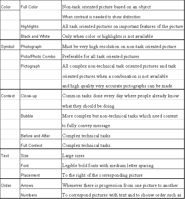
Color: this is a test to see if parts of the picture are easier to discern if the entire picture is in color or black and white, or if just the highlighted parts are colored.
Symbol: this is a test of the preference of drawn pictographs versus realistic photographs, or a combination (a photograph with hand-drawn elements for highlighting).
Bubble: this is a test of context. Should the entire picture and its elements be drawn in the context of its application with a color highlight, or should the context be drawn, with a zoom-in (a bubble) of the highlighted segment?
Context: This test is similar to the bubble test, but tests close-up (no context) versus bubble (context) versus no close-up or bubble but context.
Color photograph: color photographs versus black and white photographs were tested.
Progression: ways of progression through steps were tested, such as indicating the next step by arrows, numbers, or both.
Font and Size: Courier New, Bookman Old Style, and Times New Roman fonts were tested, as were 10-, 12-, and 14-point font sizes.
Order: ways to represent a series of steps were tested, such as numbers, letters, and bullets.
Arrangement: this test asks for preference of one- or two-column text.
Position: this set tested the position of text in relation to the associated picture. Should it be to the left or right of the picture, or below it?
Line Length: text was placed in columns and lines to determine if long horizontal lines or long vertical lines are easier to read.
4.0 Data Presentations & Analysis
As the product of this research is aimed at illiterate and ESL persons, these audiences were targeted for surveys. Results of those surveys administered to classrooms at the Council of Adult Education and the Adult Multicultural Education Services follow. Since the level of English familiarity was different between the two classrooms, references to "the higher-level" indicate results from CAE, while AMES is "the lower-level."
4.1 Test Results
The eighteen sets in the survey were designed to test seven core concepts; one of those concepts, text, can further be divided into six specific test types.
4.1.1 Color Test
Color was preferable to black-and-white in all instances, but in varying degrees. The higher-level students seemed more comfortable with full-color pictures, while the lower-level students chose black-and-white images containing color highlights. This result can be explained by suggesting that students with higher language skills can interpret more complex images, such as those containing full color. They can pick out areas of high interest without the aid of a highlight, and use the full color to aid in context decisions. The contrast between the black and white and the color aspects of the highlighted pictures aided the students possessing lower language skills in filtering out the less relevant details of the picture. For this reason, they preferred the highlights, which draw their attention toward the more important features of the picture.
Only 6% of the surveyed students chose non-color images, with 32% preferring all-color images and 61% choosing color highlights.
4.1.2 Bubble Test
The consensus in both classrooms showed a preference to color highlights over bubbles. Combined, 77% of the students tested chose the images using highlights over the images using bubbles. The bubbles providing a close up view of the image made the image more complex and hard to follow. The lines used to draw out the bubbled portion confuse the student and draws attention away from the task at hand. In order to keep the attention of the student on the task, the images must be kept simple and distractions, such as the lines introduced when adding a close-up bubble to an image, must be limited. Therefore in order to bring the students focus to the important areas of the picture color highlights should be used over close-up bubbles.
4.1.3 Context Test
Both simple and complex tasks were tested as part of the context tests. In a simple task containing no color options, close-ups or bubbles were preferred over a contextual image without close-ups or bubbles. 44% chose bubbles, and 31% chose close-ups. In the complex task of opening a smoke alarm, an image containing both a closed and the resulting open smoke alarm was the most popular choice (66%). No people selected a close-up image for use with a complex task. The numbers above represent how a person's knowledge of a subject affects the type of picture that should be used in the explanation of that task. Close-up images, such as full close-up pictures or zoom-in bubbles, can be used in situations where the task is simple and common. For example, in the case of turning a doorknob, the close-up image gave guidance regarding needed to be done by giving more detail to the task instead of the environment.
4.1.4 Symbol Test
Photographs by themselves proved to be an unpopular choice, represented by only 12% of the student selections. Pictographs were chosen 48% of the time and a combination of photographs and pictographs (photographs with pictorial highlights) were chosen 40% of the time. Photographs often incorporate details unrelated to the task at hand, distracting the viewer. Pictographs, on the other hand, show detail only where necessary, including helpful arrows and aesthetically pleasing straight lines and distinct edges.
4.1.5 Color Photograph Test
When full photographs are the only choice available, color was preferable 83% of the time. Color adds more contrast between the objects in an image making the photographs instructions easier to understand and follow. When black and white images are used, background images such as walls can block out important objects. This was demonstrated in the iron symbol test, when a black and white photograph of an iron being filled with water was confused with the wall in the background, as was suggested by students during the test.
4.1.6 Progression Test
The clearest choice in the progression test proved to be those with the most visual aides to assist readers in moving from one step to the next. When numbers, arrows, or both were offered, the combination of numbers and arrows was chosen 66% of the time. The combination allowed students who did not understand the numbering alone to follow along the progression and vice versa.
4.1.7 Text Test
Text is not necessarily distinct from graphics, since both are incorporated in the visual layout and design of a brochure. To help analyze various aspects of text design and placement, these tests were employed: font, size, order, arrangement, position, and line length.
Font & Size Test
Bookman Old Style was the preferable font, with a selection rating of 76%; Times New Roman and Courier New came in a distant second and third, at 17% and 3%, respectively. Bookman Old Style uses moderately large letters that are easy to see and read. The letters are spaced so that individual letters do not interfere with those adjacent to it. For this same reason, larger font sizes were preferable. People chose 14-point 72% of the time; 12-point was chosen 21% of the time; and 10-point, 3%.
Order Test
Numbers, which are more common across cultures than letters, were the preferred choice to indicate a series of steps, chosen 69% of the time. Letters were chosen 14% of the time, and 10% of the time, bullets were chosen.
Arrangement Test
The visual layout of a numbered list of steps was preferred in a single, straight-down column. Chosen 76% of the time, this option was more popular than the more complicated layout of two steps per line, forming two columns.
Position Test
The students preferred to have the text appear on the right side of the image in 62% of the cases. Since the progression of the English language follows from the left-hand side of a page to the right, the left part of the page will be viewed first. Furthermore, since people with low level reading skills rely on pictures, it makes sense that they prefer that the picture be on the left hand side with its corresponding text to the immediate right.
Line Length Test
Long lines and short columns of text were chosen 72%, making short lines and long columns the less common choice because they break up the reading by requiring more right-to-left eye movements.
4.2 Further Observations
Black and white images can be hard to follow and understand, as there is little contrast between the objects in the picture. Color should be used in some form whenever possible. This idea was illustrated in every test that used some type of color including the color test, the bubble test, and the photograph test. In the color test, black and white images were only selected 6% of the time. The bubble test further illustrated this point by comparing a black and white image using both context and a close-up to emphasize a certain section of the picture to an image that used highlights. Again, the black and white picture was only chosen 21% of the time. The photograph test presented a choice of the same picture where one was in color and the other black and white. Following the trend seen in the previous two tests, black and white was chosen only 17% of the time.
While completing the tests, the students were encouraged to offer feedback on what choice they made. During the photograph portion of the test it was believed that the resolution of the photographs used was too low and that higher detailed and quality photographs would increase the effectiveness of the photograph as a means of communication. The students' comments suggested that the combination of a high-resolution photograph with a pictograph would communicate a task better than a pictograph alone. Representing important objects in the photograph, such as the person or object of interest, as a pictograph, such as the introduction of a white background and instruction arrows, reduces the confusion of the photograph and resolves the detail problem of a pictograph. This concept is illustrated in the symbol test where the use of a low-resolution picture in pictograph form was chosen 40% while a pictograph was chosen only 8% more than that.
In set eight of the test, a context test was conducted using a smoke alarm. The use of the smoke alarm introduced a complex task and a before and after option. 66% of the students chose the before and after option over a context picture and a close-up. In previous tests people chose some form of close-up 75% of the time. The choice of the before and after picture over a close-up and the choice of a highlighted picture over a bubble suggests that a combination of the two types of pictures would further enhance the readability of the image. The use of a before and after picture that incorporates a highlight to focus attention to the important aspects of the image guides the user through the task showing precisely what will be viewed while following the instructions while still keeping their attention on the main points of the image.
5.0 Results and Recommendations
5.1 Guidelines
From the data gathered from the surveying, many guidelines and suggestions can be made. Since all the data was conclusive, the guidelines can be recommended with confidence. Only in a few cases did the results of the test not result in an overwhelming majority, which is taken into consideration and analyzed as to why this is expected. The recommendations and conclusions of each category tested are presented separately with a table summarizing all the results following.
Based on the study, color should be used whenever possible, in varying degrees. Several tests included color in various settings; each produced results that favored color. The degree of color depends on what is being demonstrated in the picture. If the instruction calls for a specific part of the pictured object to be manipulated, coloring just that part proves most effective. Since the intended target group is people with poor reading and interpreting skills it is highly recommended that color be used in this manner. All the results from the research suggest that people who are easily frustrated with instructions prefer highlights to black and white, and full color. Furthermore, the study indicates that color should be strictly limited to the major functions of the task being illustrated. Unnecessary highlights increase the complexity, and in turn the understandability of the picture.
A further recommendation can be made concerning the amount of highlighting that should be used. The number of different colors in any given picture instructing a complex task should be limited. When highlighting the important functions of the task, the research suggests that only a small range of colors should be included. If a broad range of colors is used, the reader could interpret their meaning incorrectly. They could, for example, think one color is more important than another is or think that the colors are implying a sequence in the instructions.
From the results of the survey, it can be determined that if the picture is of a general object or action with no focus, then using full color, as opposed to black-and-white, is more effective. Generally, color is more attractive because it appeals to the reader and will, in turn, help to limit the frustration they may encounter. The results of the survey further indicate that full color pictures should only be used when the picture is full context and no major task must be completed. They may also be used when the central focus has no related instructions or tasks, such as pictures of objects or people. If the intent of the picture is to instruct, highlights should be used. If the intent is to draw the consumer’s attention through attractive pictures, then full color is preferable.
The detail of a photograph contributes to both the reason photographs should be used and how they can cause confusion. It was found that the background detail of the photograph, complicates the directions and can be unnecessary while the foreground detail is essential. Furthermore, the results suggest that using a combination of pictographs and photographs is a better choice than using either one individually. Photographs alone lack both the ability to draw attention to a specific feature, and the means to imply instructions or directions. Pictographs, on the other hand, are not as realistic as a photograph, making it difficult to compare the objects to the real world equivalent. Pictographs are also commonly misinterpreted, as caused by different audience backgrounds (such as culture differences). The data indicates that a combination of the two forms of pictures is easiest to understand. Feedback from the participants, explains that the reasoning for this preference is that this combination makes it possible to have the detail of a photograph in the foreground while still allowing for instructional arrows to be added to the background thus increasing the clarity of the overall picture.
If it is necessary to use pictographs, they must be made so that they are as close to universal among all groups as possible. The research further suggests that pictographs must also be consistent. For example, in common pictographs such as those representing people, it would be advisable to use a symbol that is already in use, such as the symbols of males and females on restroom doors. Adapting symbols and pictographs from other common uses will increase the understandability of the instructions greatly. Participants expressed favoritism to pictographs that were aesthetically pleasing. It is recommended that straight edges and distinct lines be used whenever possible. Pictographs must also be drawn to accurately represent the object to eliminate any misinterpretation as to the meaning of the picture.
Using pictographs in a photograph, such as arrows, to highlight the necessary aspects of a photograph is the best resolution because it helps draw attention to the parts of the picture while still having the detail of a photograph. Any photographs used should be high-resolution and contain color; otherwise, details of the photo can be lost. It should also be taken into account that extraneous details in photographs can cause confusion and should be limited or removed by placing the essential sections against a white background (i.e., removing unnecessary context).
Based on the results, it can be said that bubbles and close-ups are both advisable techniques in conveying instructions pertaining to common everyday tasks. When depicting a simple task, context is unnecessary, and so can be left out of the picture. This omission will not result in loss of understandability by the reader, who presumably is familiar with the simple task. Simple tasks used in the research included changing a light bulb and opening a door. If the reader is familiar with these tasks, further context clues are not needed to interpret the situation, as long as accurate pictographs or high resolution photographs are used. Using a close-up image will limit the possibilities of misinterpretation.
The survey also tested complex tasks where the results indicate that context is necessary to give an understanding of the complete object being handled and the environment in which it is being handled. The amount of context shown is important. The focused object must be sufficiently large for the reader to clearly recognize it. It also must be clear what is being done to the object, and where in relation to its environment it is being handled. Therefore, it is recommended that when representing complex tasks or objects, the use of before-and-after techniques or full contextual images with highlights be used because they help convey the meaning of the instructions being given. Full context images using highlights give the reader just enough information as not to confuse the situation while still drawing attention to the area of importance with a highlight. In some cases it may be more appropriate to use before and after, especially if the object's orientation or placement in the context changes significantly during the task.
From examining the various types of text used in the survey, many correlated conclusions can be drawn. The font and size tests showed that low-level readers prefer large (14-point) text to medium (12-point) and small (10-point) text, and that larger, more legible fonts are also preferable. The most preferable text was Bookman Old Style Text compared to Times New Roman and Courier New. Courier New had thin letters making it hard to read and Times New Roman had small spaces making the letters blend together. Therefore, any font with similar characteristics to Bookman Old Style should be appropriate. In other words, the spacing between letters should be small enough to allow word formation without confusion with word spaces yet still be large enough to keep from the effect of letters blending together.
Further testing showed that the text should be positioned secondary to the picture, so that it is an aide in the instruction and not the main means of conveying information. Therefore, placing the image first, and then the text to the right of the image (since most audiences read left-to-right), is best. The results indicate that the text itself should be displayed in long, flowing lines, because it is easier to read than breaking the text into several short lines to fit it into a tight column space. Sentences themselves should be kept as short as possible, however. Use minimal amounts of text when there is also a picture available.
If it is necessary to give steps in a set of instructions, the order in which the steps are represented must also be clear. Numbers were preferred and are generally more likely to appeal to a wider audience than letters from a language-specific alphabet are. This method of representing a sequence is more likely to be understood than letters or bullets. Listing the steps in a consistent, flowing direction, such as straight down was preferred to having two columns of alternating steps. Therefore, a manual should present instructions in one direction, and remain consistent throughout the document. It was also found that when pictures accompany the directions, the pictures should be numbered in the same manor as the corresponding text.
Not only should the text and corresponding pictures be numbered the same, but also the text should be directly next to the picture using arrows to show the progression from the picture to the text (preferably to the right). The results of the survey support the use of arrows to represent progression from one set of instructions to the next. However, arrows should not be used in place of numbers, only in conjunction with them or when numbers are impractical.
The physical format of the brochure must also be decided before layout can begin. Although there are many forms a pamphlet may take, a large size grants the space for following many of the above recommendations. For example, using a small pamphlet may require text to be squeezed into columns, forming difficult-to-read short lines and long columns. Similarly, steps may need to be placed lined up side-by-side, causing confusion by lacking a logical, consistent flow.
Therefore, the brochure should be of at least the standard paper size of the area. A tri-fold design, consisting of three flaps, allows plenty of space to present the necessary information and was preferred by the participants. Any confusion regarding which pages come first can be resolved by numbering the pages, since most of the target audience understands numbers.
Further research into the overall layout is recommended. The document’s layout can help as well as hinder any individual trying to interpret it. It is also recommended that further research be conducted in the area of high-resolution photographs and their combination with pictographs as the photographs used in this research were of low resolution. If further research was conducted more correlations between pictures and situations could be drawn producing an even more effective pamphlet. The above guidelines, when followed, should produce clear, coherent documents accessible to audiences with a wide range of language skills. A specific audience can be more directly reached by researching the wants and needs of that audience. These guidelines are intended for a general audience without requiring the language skills common among most English-speaking people.
The following tables summarize what guideline to follow in any given situation that is likely to arise when creating an informational brochure with illiterate and ESL people in mind.
Guideline Summary
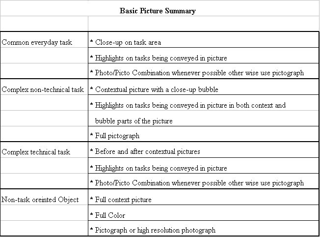
For an example of the application of these guidelines, see Section D.8.
5.2 Future Work
The sample brochure seen in Section D.8 is a product of the results of the test administered to Australian classrooms in the month of April These classrooms took their summer vacation shortly thereafter, and were unavailable for a follow-up visit to test the effectiveness of the sample pamphlet. The brochure should be tested to assure it meets the criteria of both this chapter's guidelines and those of the manufacturer.
A larger variety of subjects would also be helpful in testing for guidelines. People from various cultural backgrounds or who have difficulty with English for different reasons (mental retardation, for example) may react to visual communication in different ways.
A.1 Description
Scientific Services Laboratory (SSL) is a branch of the Australian Government Analytical Laboratories (AGAL). SSL is an independent, technical resource, specializing in the forces, materials, technology, and concepts involved in buildings. SSL provides advice, testing, and consultation for designers and builders. Specialized branches include expertise in fire safety engineering and coatings.
A.2. History of Scientific Services Laboratory
Scientific Services Laboratory began as the first government materials laboratory, established in Essendon, Victoria, in 1945 as a testing facility for the Essendon Aerodrome. The central laboratory was relocated to Port Melbourne in 1950, where its activities were extended to include other environmental issues such as water, sewerage and corrosion. This laboratory merged with the Victorian regional laboratory in 1957 to form the Central Testing and Research Laboratory (CTRL). This merger was undone in 1975, and the central laboratory became the Central Investigation and Research Laboratory (CIRL). Its purpose was to provide advice from professionals on a variety of materials, products, and processes required by Commonwealth architects and engineers. In 1986, CIRL was renamed to Scientific Services Branch, and became known as Scientific Services Laboratory (SSL).
SSL has over 50 years of knowledge and experience, making them a leader in the fields of fire safety engineering, appraisal and listing of active fire protection equipment, and paint and coating technology.
A.3 Internal Hierarchy of Scientific Services Laboratory
A Scientific Director manages SSL at its top level. There are five teams beneath the director. The fire department consists of fire risk engineering, fire systems, and Activfire. Coatings includes Australian Paint Approval Scheme (APAS) and Painting Contractors Certification Program (PCCP). Construction Materials contains the subgroup Analytical Chemistry. Quality assurance and administration are the last two groups.
See Graph A.1 for a pictorial representation of this information.
A.4 AGAL Hierarchy
The Australian Government Analytical Laboratories includes many branches, one of which includes SSL. From the General Manager/Australian Government Analyst, the structure descends to include AGAL Operations, AGAL Sydney, AGAL Melbourne, SSL Melbourne, and AGAL Perth, in that order.
See Graph A.2 for a pictorial representation of this information.
Appendix B: Classroom Research
B.1 Introduction
Mrs. Avram created a unique opportunity when she put the group in contact with Mrs. Ivana Gordy, a teacher in the Quinsigamond Outreach Program of St. Paul's. Mrs. Gordy is a teacher of adult education classes; her students are adults who read on approximately a fifth grade level. Nearby classrooms were composed of ESL students, to whom she also had access. Mrs. Gordy invited uthe group into her classroom for whatever research or surveying needed to be conducted. Two visits were made. The first entailed examining the manual included with the Family Gard smoke alarm (see Section VII) to detect areas for improvement. In the second visit, a manual of the group's own design (again, see Section VII), based on their prior recommendations, was supplied, and experimented with to see which of the two manuals was clearer.
B.2 First Visit
The first visit to Mrs. Gordy's class was on the morning of Wednesday, February 16th. Positive results were realized, though with effort; the classroom consisted of mostly ESL speakers, who were more inclined to speak to each other, if at all, than to the project group. They had little experience installing smoke alarms, as most of them lived in complexes where such devices were the responsibility of the landlord. Some alternative suggestions to the design of the Family Gard manual were provided, and came to a few conclusions.
First, images must be put in a context. Mrs. Gordy said there is a movement to "contextualize" throughout the curriculum. This means that it is more effective to represent something through a whole picture, not a partial one. For example, showing a section of a smoke alarm is confusing, while drawing the entire alarm is clearer. Similarly, in the instruction to place the alarm on the ceiling, it is best to show the entire room, not just the corner where it will be installed. The layout of the manual must also flow logically, and the English must be simple and brief.
After taking these suggestions back to WPI, an original manual was designed. Since the Outreach program observes the public school schedule, there was no class the next week, so the next visit would be on Wednesday, March 1st.
At the second visit, Mrs. Gordy gave the project group a list of points from her students regarding our first visit. Pictures 1, 3-5, 8, and 10 of the manufacturer's manual were especially confusing. The text of the manual must be in easier English so as to use them to understand the pictures. Also, it seemed easier for men to understand what to do from looking at the pictures than it was for women.
B.3 Second Visit
After designing a prototype manual, the group returned to the Outreach program. A large section of drywall, a drill, two Family Gard smoke alarms, and both the original manual and the new one were supplied. The drill was equipped with a screwdriver bit, strong enough to make a hole but not to hurt anyone - a consideration, since many of the students had not used a drill before.
There were six students, who were split into two teams; each was given a copy of the Family Gard directions. With minor difficulty, they were able to install the alarm. One mistake involved marking four drilling holes with a pencil, whereas only two are needed.
The students found many points of the new manual clearer. In step one, the whole alarm is shown, not just a part, making it easier to figure out what it was a picture of. Step two showed two pencils, one for each hole, which would prevent confusion as occurred when they followed the manufacturer's instructions. The students found the written instructions to be of sufficient level and brevity for them to understand. Mrs. Gordy recommended a separate illustration labeling all the parts of the manual, which could be incorporated in a later, more complete design.
The feedback from this second trip was positive. The new design methods seem effective, suggesting that these key concepts are integral to designing effective brochures for these audiences.
B.4 Australian Classrooms
The survey used to test key concepts (see Section D.5) was presented to classes at the Adult Multicultural Education Service (AMES) and the Council of Adult Education (CAE). At the former, students were divided into lower- and middle-level skill levels. One group member administered the survey to the upper class, while the other two members tended to the lower class. Once the reason for the survey was understood, the students were friendly, helpful, and communicative. The lower-level students required a translator for help in understanding the test, but were equally helpful once this obstacle was overcome. The higher-level group included a student who understood the proctor's native English, and would translate it into broken English for the rest of the students to understand. Some students tended to move through the survey at a faster pace than the proctor was prepared for; this was at their discretion, and those students moving at a slower pace were not left behind.
The visit to CAE was equally productive. The students understood spoken English without difficulty, and moved through the survey at the pace set by the proctor.
Appendix C: Analysis of Sample Pamphlet
The guidelines were followed when producing the prototype pamphlet in order to ensure that it could be read and understood by all audiences. The following section explains how these guidelines were followed, and makes suggestions to future alterations that could be made to the pamphlet with different resources.
The font of Arial was used for all text in the pamphlet. Arial uses clear, bold letters with sufficient spacing to prevent letter blending. With straight letters and no serif, it is one of the simplest fonts.
The text was also put to the right of all of the images to follow natural reading order, and uses a bold feature and blue highlight to emphasize the important words in the text. This allows people with low literacy levels to pick out the important words instead of being confused by trying to read through all of the text.
Progression arrows and numbers are used throughout the pamphlet to guide the reader. Both features were used in accordance with the guidelines to supply the most visual aids possible to aid the reader without cluttering the pages. Without this feature, the reader might not follow in the order that was intended. Some of the progression arrows were highlighted in red to show action, while the black arrows were used to show progression through the manual.
Commonly used pictographs, such as equal signs and price tags, were inserted into some of the pictures to take the place of words and lower the need for text. In the first section on page one, there is a full-color, contextual picture of a man being woken up by a smoke alarm, which was used due to the fact that we are attempting to show a complex non-technical situation. A highlight was used on the smoke alarm to make it clear that it, and not the smoke under the door, is waking the person up.
Whenever possible, actual pictures and accurate sketches were used in place of cartoon pictographs, in order to lower the chance of misinterpretation. All the top-view pictures of the smoke alarms were scaled drafts of an actual smoke alarm, as well as the actual SSL, Australian Standards, and Activfire logo that can be found on smoke alarm packages. Some cartoons were added, however, to make the pamphlet more visually appealing, such as the man holding two brands of smoke alarms.
The colors used in the pamphlet had to be chosen carefully, especially when attempting to compare two ideas. This concept is illustrated in the "Where should I put them?" section. In the first draft of the manual, the "must" smoke alarm was red and the "should" smoke alarm was green. In each case, the hue and saturation of the colors were similar, making it hard for the color blind to tell a difference between the two smoke alarms. Red also could also be interpreted as if was signifying places to avoid putting one. To correct this, "must" smoke alarms were changed to a dark green and the "should" smoke alarm to yellow, following the colors on a traffic light.
In order to show noise, lines emanating from the smoke alarm were drawn into the picture. The color and size of those lines illustrated the intensity of the noise. For the loud noise of a smoke alarm test, red lines were used; for the beep of a low battery, green lines were used. Red is most commonly affiliated with "stop," "bad," or "danger," and thus was a good choice for the loud noise made when testing a smoke alarm. Green, on the other hand, can mean "go," "good," or "safe"; thus, it was used for the beeping noise. The size of the lines also varied with the intensity of the noise. In the case of the loud testing noise, longer bolder lines were used than can be found with the light beeping associated with a low battery.
With different resources, the pamphlet could be improved, especially in the case of using a pictograph-photograph combination to illustrate ideas. In many cases in the pamphlet, this idea could have been used effectively. The picture of the man being awoken in the first section could be changed into a pictograph-photograph combination, as long as the resolution of the photograph was high. Another area that could have used this type of picture can be found on the last page of the manual, in the cooking section. The pictograph of the stove and smoke can be replaced with an actual photograph, with the background removed and the instruction arrow added in.
In summary, it is important to follow the guidelines in every aspect of the design process in order to ensure that all audiences can interpret the final product.
Appendix D:
Graphs and Manuals
Appendix E:
Survey Used in Melbourne, Australia
Part 1
Part 2
Sample Pamphlet
Berg, Bruce L. (1989) Qualitative Research Methods for the Social Sciences, Third Edition . Boston: Allyn & Bacon
Bocker, M. (1996). A multiple index approach for the evaluation of pictographs and icons. Computer Standards & Interfaces, 18, 107-115.
Chase, N. (1998). Visual documentation simplifies assembly. Quality, 37, 50-52.
Dreyfus, Henry (1972). Symbol Sourcebook. New York: McGraw-Hill Book Co.
Houts, P., Bachrach, R., Witmer, J., Tringali, C., Bucher, J., & Russell L. (1998). Using pictographs to enhance recall of spoken medical instructions. Patient Educating and Counseling, 35, 83-88.
Hussey, L. (1997). Strategies for effective patient education material design. Journal of Cardiovascular Nursing [Online]. Available: Electric Library. [1997, January 1].
Jorgensen, Danny L. (1989) Participant Observation: A Methodology for Human Studies. Newbury Park: Sage Publications.
Lester, P. (1995) Visual Communication. Wadsworth Publishing Company.
Templeton, Jane Farley (1994) The Focus Group. Chicago: Irwin Professional Publishing.
von Koenigseck, Edward (1991) Technical Writing for Private Industries: The A-to-Z of O&M Manuals. Malabar, Florida: Krieger Publishing Company.
Wilbur, Peter (1989) Information Graphics: A Survey of Typographic, Diagrammatic and Cartographic Communication. New York: von Nostrand Reinhold Company.
Young, Pauline V. (1966) Scientific Social Surveys and Research. Englewood Cliifs, NJ: Prentice-Hall, Inc.